- After Effects Tutorial
How to Make an Animated Logo in After Effects
Feb 28,2020• Proven solutions
One of the more popular things you can do with After Effects is to create an animated logo for your, or your clients, business. Its eye catching, desired and a great way to impress customers, so let us have a look at what is involved.
This is a basic tutorial about After Effects, professional video editing software. However, if video editing is new to you, consider Wondershare Filmora, which is a powerful but easy-to-use tool for users just starting out. Download the free trial version below.
How to Make an Animated Logo in After Effects
1. Setup
Our first job it to set up our project ready for animation, so first off is creating a composition using Composition>New to work in. I used a small web resolution of 320 x 240 setting for this purpose.
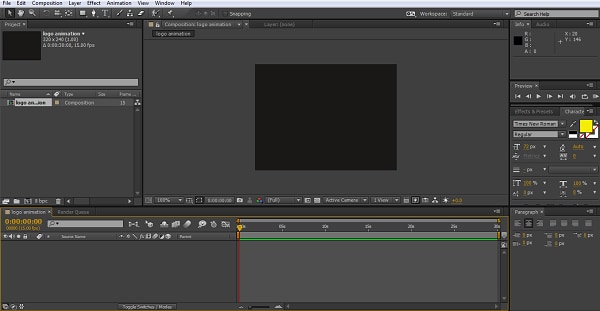
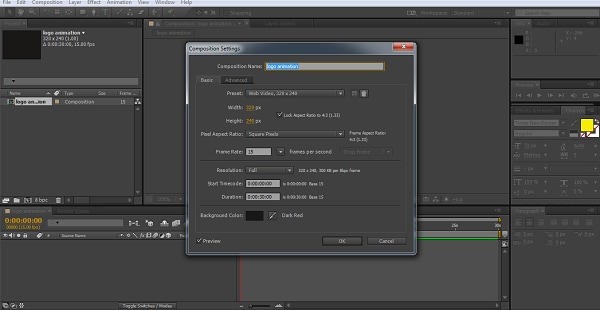
Now we have our framework, we need something to build on, so next we create a solid layer for our Logo by using Layers>New>Solid, choosing an appropriate color to match your composition. I used #000000 which is Black for both.
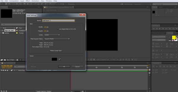
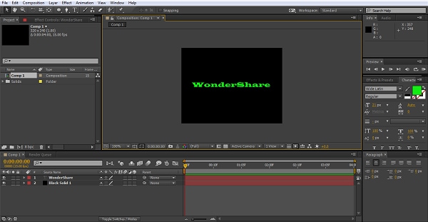
Now we have our background let’s create our logo. Now here you can add in a pre-prepared logo, artwork or whatever to work on, for simplicity I’m just going to use a simple text object as my logo to demonstrate the technique.
So, I now I go through Layer>New>Text and create my text layer. Adjust the text size and color so it can be seen clearly and we are done.
2. Alignment
Now we have our Logo, such as it is, we can begin to manipulate it to create animation. If you need your logo to be perfectly centered, or any other object in fact, a handy hint is to use the grid to ensure everything is right where you want it, you can access that by using the button in the composition panel as shown below.
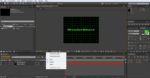
I’m happy where my text is for this one, but it is a useful tool to know about no matter what you are doing.
3. Adding the Effect
For our first attempt at animation we are going to use the effects built into After Effects itself, this is by far the most straightforward way of getting some impressive results. For this one, we highlight the Solid Layer in the Timeline panel, and then choose our effect. You can either go through Effect>Simulation>CC Particle World to get to the one we are using here, or simply go to the effects and presets panel on the right and drag the CC Particle World effect onto your solid layer. Whichever way you go, the end result is this.
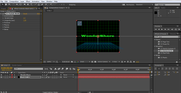
The effect controls on the right are quite comprehensive, and playing around with them you can find some interesting results, it really does pay to experiment when trying these kinds of new projects just to understand what is possible. Whilst here we are looking at the Particle World simulation effect for instance, you could try others to see if you prefer the effect. Here I adjusted Gravity to .200 as it makes the particles shoot towards the screen a little more and I prefer the effect, and matched the particle color with the text.
4. Getting the right Order
The next step is a simple one but worth mentioning. When trying any sort of animation, you must get into the habit of having your layers in the right order for it all to work.
Here we created our solid layer first, and the text sits on top. This means any effects that are applied to the solid layer happen underneath the text, for some applications that may be what you want, here, we want the animation to go over the text for the effect we are looking for, and so we switch the layers around. This is as easy as dragging the text layer underneath the solid layer in the timeline panel.

Always consider what should go on top of what in your proposed project, whether it is animating a logo, using a mask or any other technique in After Effects visualizing what order things go in, is one of the skills you develop along the way.
5. Setting up the Animation
As with most things in After Effects, keyframes are the foundations of this animation, and we control the animation of the particle effect through its birth rate setting, found by expanding the settings in the timeline panel for the solid layer as we can see here,
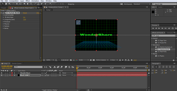
Pressing the stopwatch icon creates a keyframe, and we are going to create 4 here, in this example a couple of seconds apart but for regular use the timeline probably wants to be a bit shorter, no one wants to look at a logo for 12 seconds to see what it’s doing after all, the effect should be immediate.
As I create each keyframe I adjust the Birth Rate field, starting low at 1, then going up to 70 at the second keyframe, and 120 at the third, and then a 5 second run to the final keyframe which is set at 0, the idea being that the particles gradually diminish revealing the logo text below it.
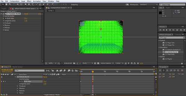
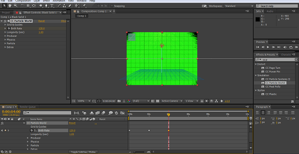
A very simple setup, there is no doubt, but it works and as you can see is easy to accomplish.
6. Working with Vector Graphics
Whilst a nice and simple effect it is basic, if you have access to .ai logo files or other vector graphics you can try this one as well. These files are created in adobe Illustrator, and the contain layer information to allow after Effects to manipulate the various components individually. Learning to use .ai files effectively is an important step in discovering the possibilities of After Effects.
First off import your vector graphic into After Effects, this is as simple as dragging the file onto the project panel which brings up an import dialogue. It is important to select the ‘composition retain layers’ options, which results in a new composition with the various layers of the image all displayed for you.
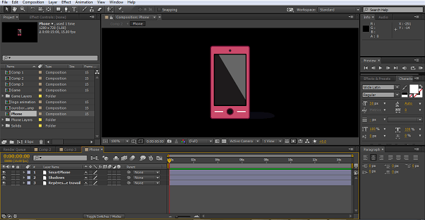
You can add movement, effects and so on to these as you can anything else in After Effects, in this instance I will just add a rotation to demonstrate.
As we have seen before, animation revolves around keyframes, and here is no different.
I simply click the stopwatch next to the rotation option in both the smartphone layer and the shadows layer, move the timeframe on, adjust the rotation of each item to the same values, move on and repeat as we have seen before.
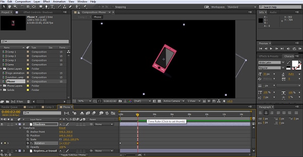
I used 4 keyframes in the end to create a nice revolving effect. You could of course combine this with the previous animation and have a spinning logo appear from the particle spray, or any other of the effects that are found in the program. I cannot stress enough how important just a bit of experimentation can be to discovering new ways to use the tools we are given.
7. Conclusion
I hope this has given you some ideas for simple animations you can add to logos, titles and so on in your projects, there are certainly far more spectacular things you can do given time, but we all start somewhere.
Bring up your video to a professional level with straightforward tools.
Try It Free Try It Free


Nathan Gray
ON 2020-04-21 05:35:46
How do i download after effects